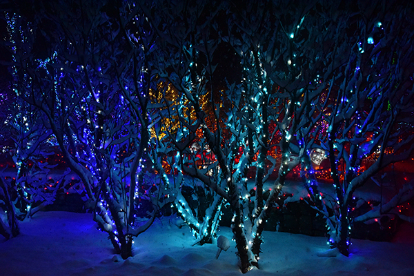
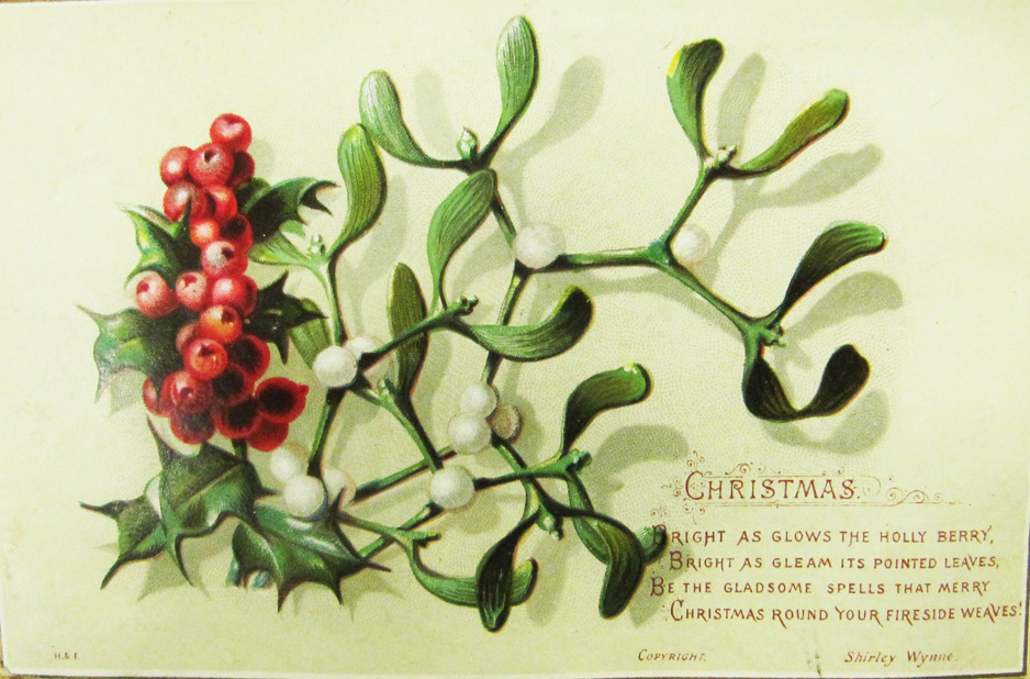
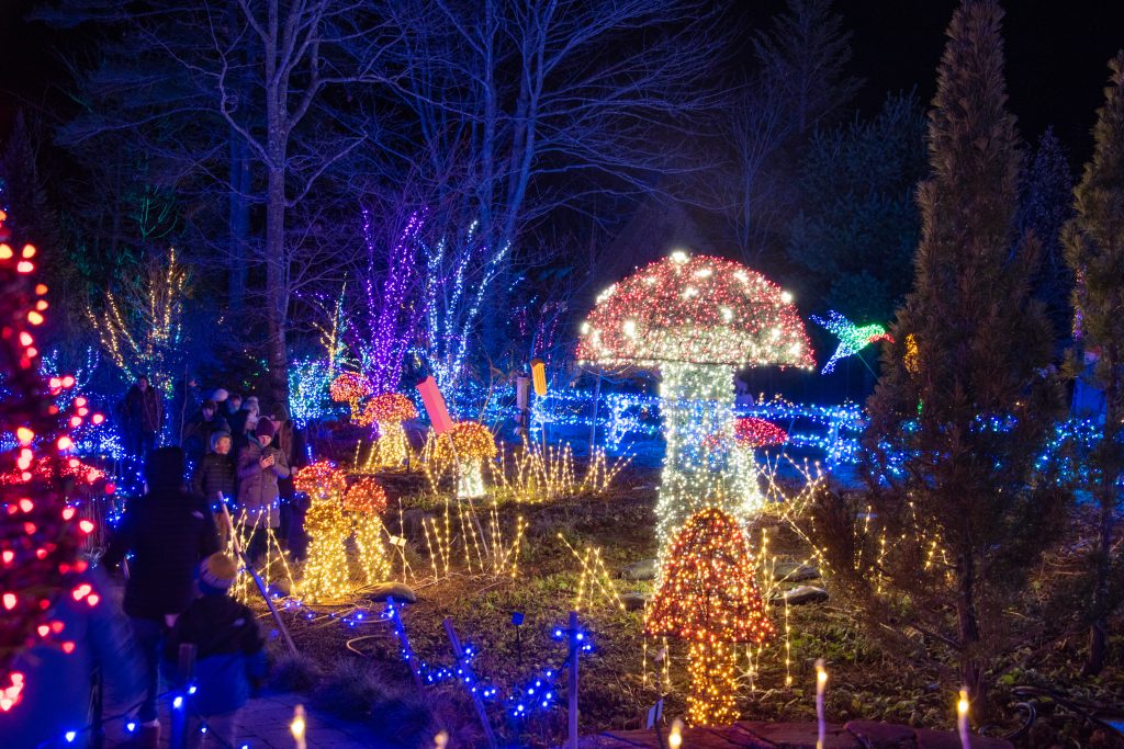
Since it sets the tone for the overall feel of your design, your color palette may be the most important decision you make when you begin your holiday lighting adventures. Color combinations involving red, white, and green typically feel more classic, while unexpected colors like teal or pink feel more whimsical. When selecting your color scheme, think about the scope of your area and try for cohesion, rather than an overwhelming display of color.
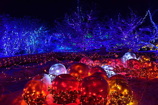
Schemes we use in the Gardens:
• All white (very simple and evocative of winter)
• Multicolor strands (cheerful and childlike)
• Purple and yellow (unexpected and enlivening)
• Two shades of the same color (i.e. we used two shades of pink on the big sugar maple last year)
• Red, orange, and yellow (a fiery burst of color in the midst of winter)
• Pink, warm white, aquamarine, and purple (quirky and frosty)
• White and green (an elegant statement on the season)
• Red and blue (fire and ice)
• Blue, purple, white, and aqua (joyous and reminiscent of brightly wrapped packages)
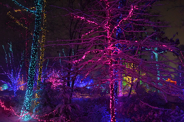
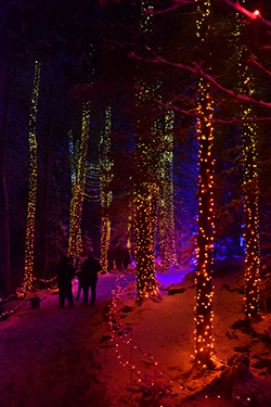 When it comes to wrapping your trees, your house, or setting up path lighting, you can choose from a variety of approaches.
Here are some we’ve tried in the Gardens:
• For an ombre effect, try stringing lights from dark to light, vertically.
• Choose your favorite color, and make that the dominant hue. Then, choose a complimentary color for your highlights.
• Try the 60-30-10 rule: 60% dominant color, 30% secondary, 10% accent if you’re covering a large amount of space.
• Or try the rule of three: limit your palette to just three colors for an organized, well-balanced design.
